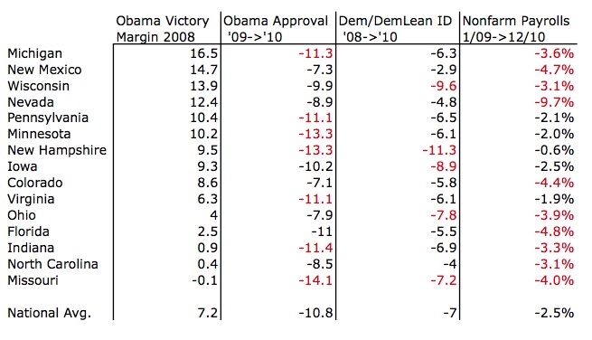
In recent days, Gallup has been putting out great state-by-state numbers on Obama’s declining approval ratings and declining Democratic Party identification. The information is not clearly predictive of election day 2012. Much is sure to change, and much will be dependent on who Republicans nominate to challenge Obama. But a look at the likely swing state data gives a clear glimpse of the challenging road ahead for the president. In the following chart, I lay out the shifts in state-by-state Obama approval ratings and democratic identification, per Gallup, and I add two other statistics: The margin of victory for Obama in 2008, and the percentage decline in nonfarm payrolls for each state, per the Bureau of Labor Statistics, between Obama’s inauguration and last December.
Where the state statistics are more grim than the national average, I have highlighted them in red. This is just one way of looking at the data, and it does not show other important factors that will play a role in the final result. But it does give a one shot glimpse of the structural challenges facing Obama in states like Virginia, Ohio, Florida, Indiana and North Carolina as he pulls his campaign together. It also gives Republicans some reason for hope that 2012 will not be a repeat of the 2008 wipeout.
To see the full Gallup data, see here.


